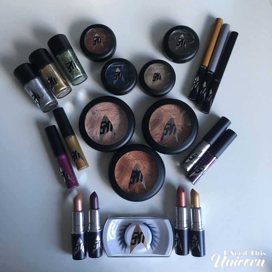
You can read my previous posts on this collection here and here.
I was waiting for the event at the Pro store so I could photograph and cover that in this review. BUT as it happens, I couldn’t find any information on when it was and then it happened and then I found out via their social media the day after. Story of my life.
I usually get mailers from my local MAC stores, either promotion for a collection or an invitation to the store. If MAC was going to send me a promotional mailer for any collection, the Star Trek one should have been it. I would have framed it and put it on my office wall. But I didn’t get any.

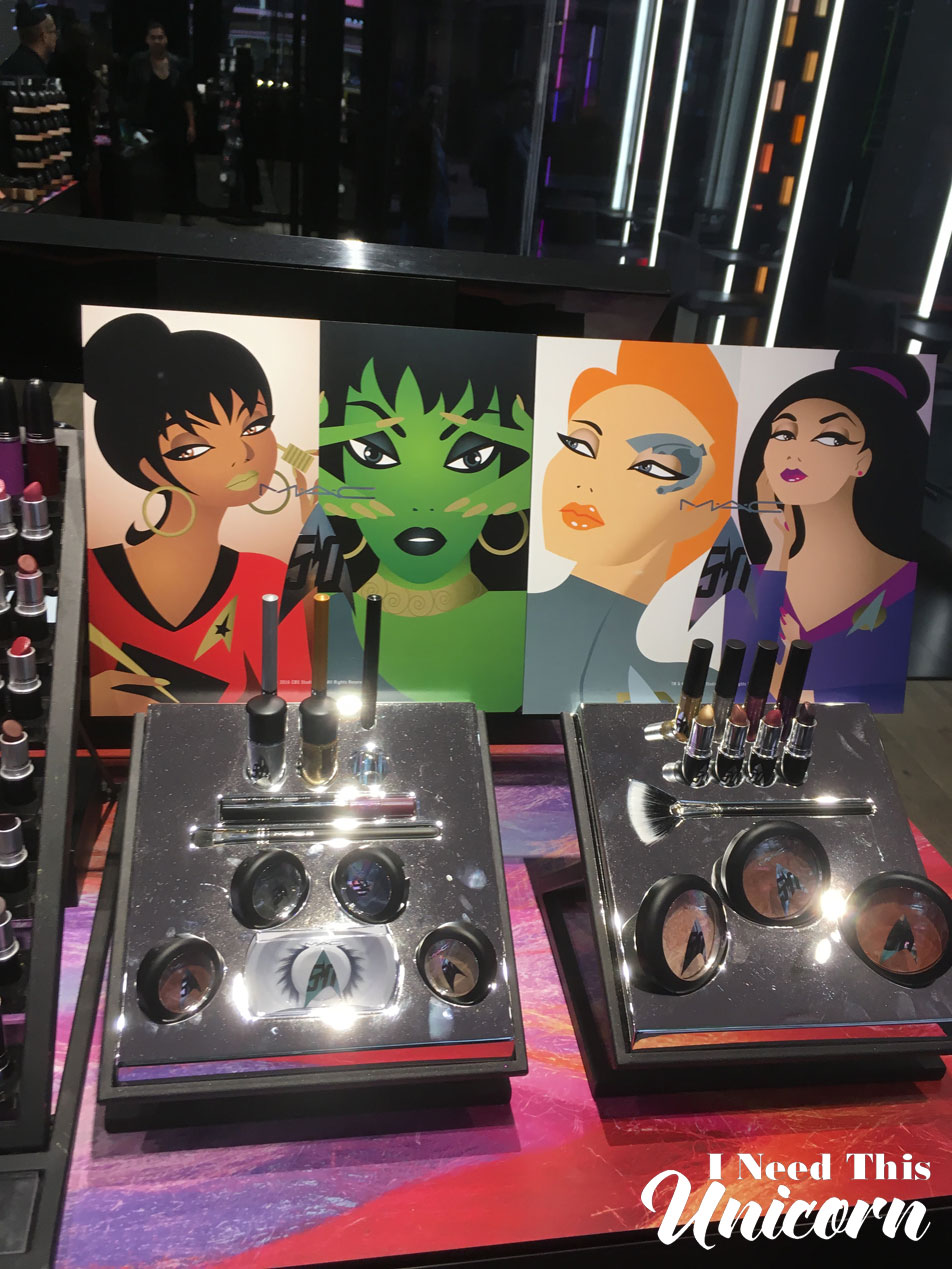
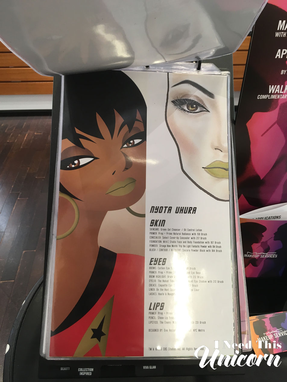
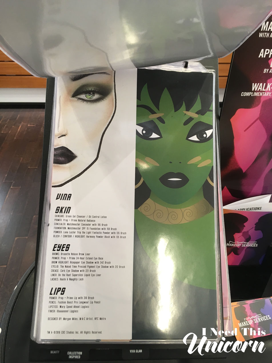
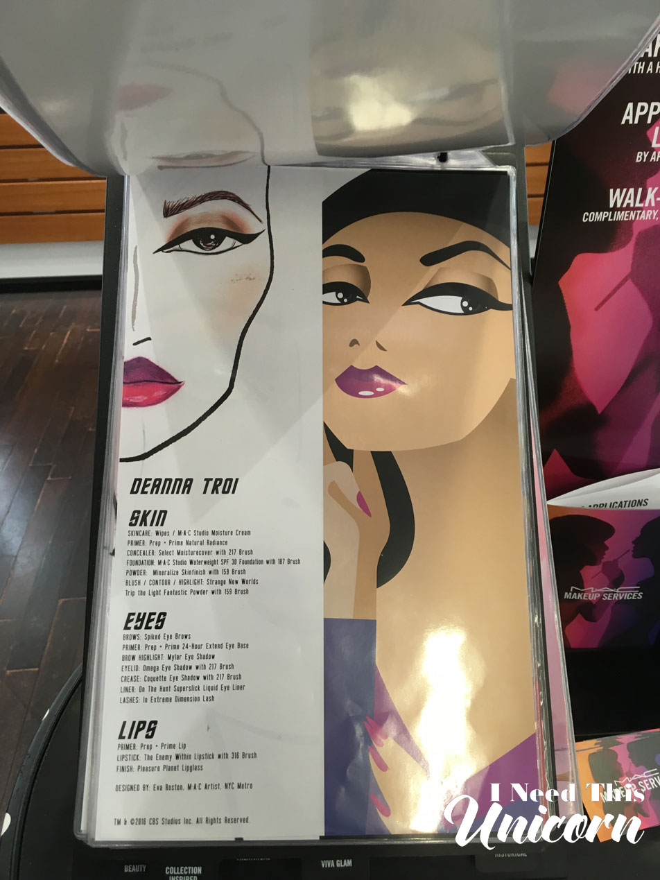
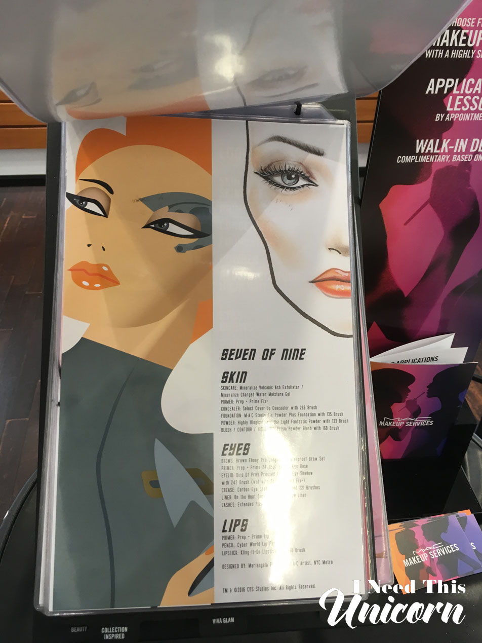
Apparently there was a transporter and two people as Uhura and Spock. It was in-store and not on the sidewalk on Market and Powell like some events. I actually went to the Pro Powell store the day it released hoping the store’s windows would be dressed up with the Star Trek illustrations, but it was Trolls. I actually got the most out of my visit at Bloomingdales, where I got to photograph the following charts for you. There wasn’t anything that could be done for that glare though.
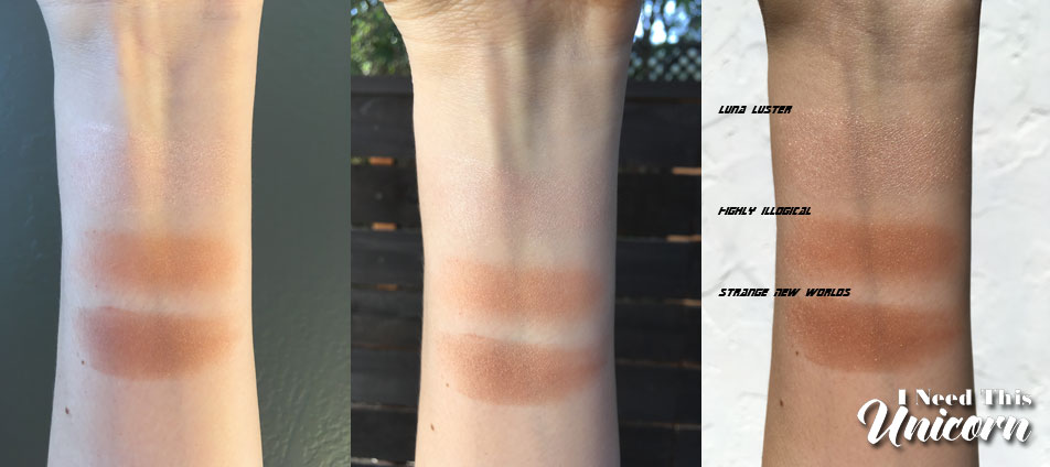
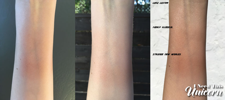
Light Fantastic Powder
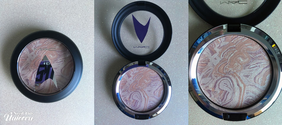
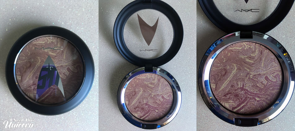
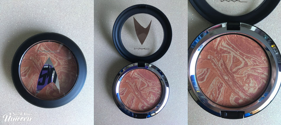
How you use these powders will depend on your skintone. They might be a highlighter, blush or bronzer. For me, I have used Highly Illogical and Strange New Worlds as a bronzer to warm up my face. Luna Luster is best as a highlighter on most skin tones, it’s very subtle if you prefer that.
The swirls go all the way through and it’s not just an overspray design. (Yay!) If you rub the pan with your finger, it looks like you messed it up. But after it swirled my brush in there, it somehow cleaned up that muddiness and it looked fine. So you won’t lose the cool planet look.
It took a lot of layering for color to even show up. For the blended out swatches, I used four layers for it to show up enough. On my face, I didn’t need to go over so many times. I think with foundation, it applies a little better because it sticks onto the product and oils on your skin.
Pressed Pigments
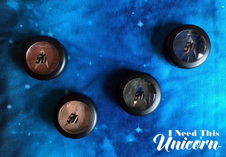

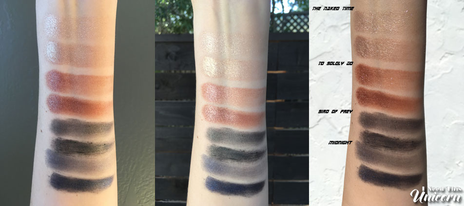
The pressed pigments should be used wet, patted on with a flat brush and applied over primer. It needs to mix with the water and stick to a base otherwise, you’ll end up with flakes all over your face.
The color is also more vibrant this way. The navy and olive green were a little pathetic dry, but looked much better wet. Especially the navy! The olive green I had some trouble working with. It needed a lot of patting and layering to get opaque. But even then, it was patchy and there was some gritty bits as you can see in the photo.
I’ve worn The Naked Time and To Boldly Go a few times, and I’ve liked the metallic finish to them and I didn’t really have issues with fallout. They added a nice sparkle on top of another shadow and also looked very strong on their own.
In the photo below, they are swatched dry and wet. The dry application on top, and wet below it. These shades were applied with two different brushes which is why the size of the swatches look different. (They were the cleanest flat brushes I had available at the time.)
Superslick Liquid Liner
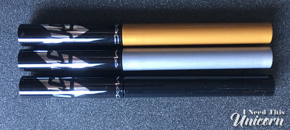
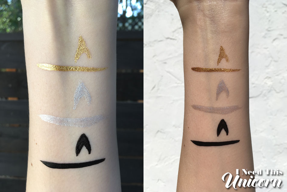
As I mentioned in the previous post, I don’t like this eye liner formula.
It’s hard to apply because of the shape of the brush and the very liquid formula, it’s very easy to mess up! After I apply I can feel it on my eyelid, it feels stiff and weird. When I remove the liner, it doesn’t just dissolve like a normal liner, it comes off in flakes, like it’s plastic.
The brush is very hard to draw with. It’s too short and not thin enough. I’m a professional artist, it should be simple enough to draw the Star Trek insignia. I’ve definitely drawn it before! But getting the lines to be perfect wasn’t happening and I had to keep going over it. Forget making a perfect point for a winged liner!
The pigment was great in black and gold, but could have been better for the silver.
Lipsticks
The lipsticks aren’t the most exciting. They’re so sheer that the novelty of a gold metallic or a deep purple glitter is smashed once you apply it.

Where No Man Has Gone Before
/insert slut joke here!
A pink with a shot of gold, I feel like this belongs in my “The Search for a Dupe” post.
It’s sheer, but I actually like this lipstick. I like how it looks on me personally. However, it would like it better had it been more pigmented. Unfortunately, it’s a lustre finish, which is my least favorite. It isn’t very long lasting. Even with a lip liner, it disappeared pretty quickly and it looked like I wasn’t wearing anything once I reached my destination. So, if you plan to wear this out, bring it with you for multiple touch ups.
LLAP
They could have used the full name. Or even better as someone else suggested “Live Long and Pucker”. I wish I could find that post again so I can give credit to the person who came up with that!
It’s a sheer copper, doesn’t look like much on me.
The Enemy Within
The Enemy Within is an episode from TOS. But I think this one could have been named after Data. I don’t see myself wearing this on it’s own, but as a topper in the center of the lips. I don’t think it looks good on me, by itself. I look washed out because I’m almost a pale yellow myself. If I had yellow contacts I might actually look like Data. Intriguing…
I think this might look really great on a deep skintone.
Kling-it-on
I like how they have fun with the names: Holladeck, Kling-it-on. I would haved liked to have seen more! I knew from seeing other swatches what to expect from this lipstick. It’s not what the bullet looks like. It’s more of a sheer gritty gray. If it was an opaque dark red-violet with glitter, that would be cool. But it’s not.
You will probably want to layer it over a dark lipstick to make it useable. I tried this over a deep purple matte liquid lipstick. You can see the red glitters and of course transforms the matte lipstick to give it a sheen. It’s definitely best layered over something pigmented cause it just makes your lips look patchy and gray on it’s own.
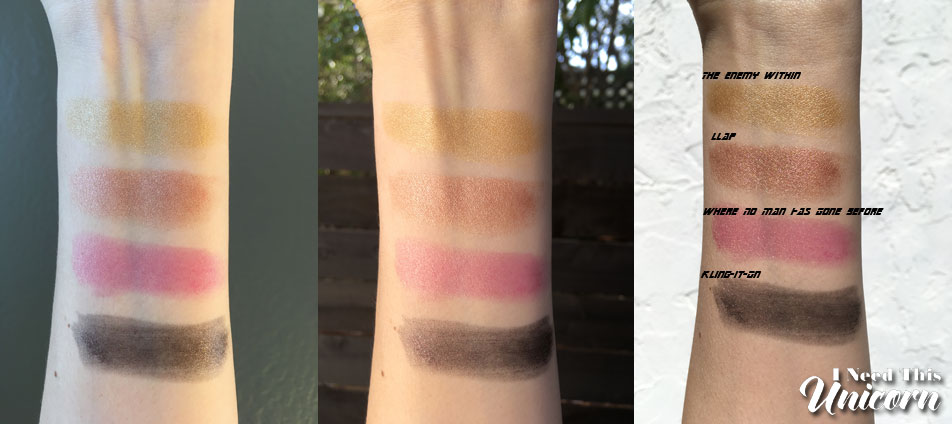
Lipstick comparisons:
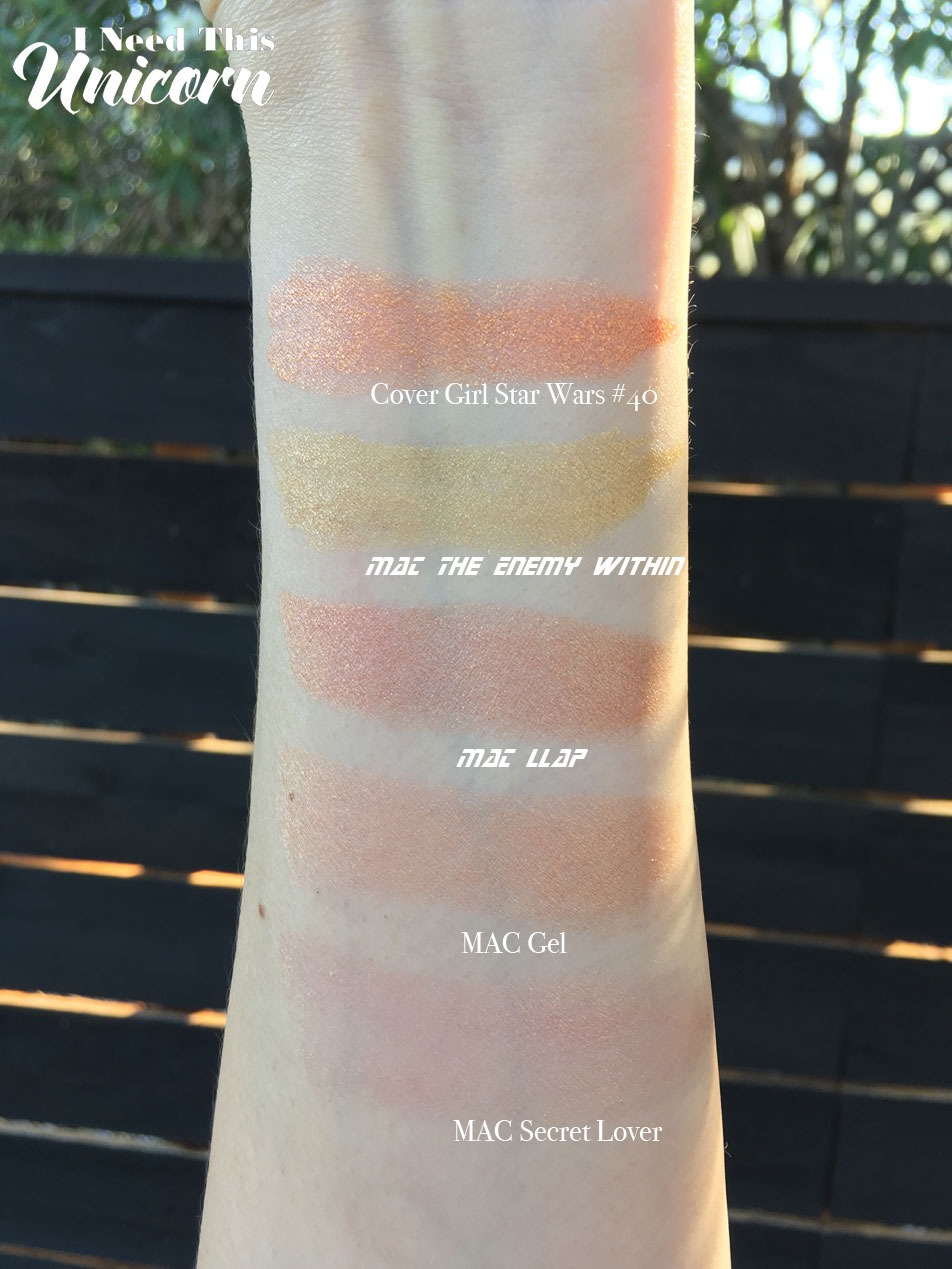
I compared the gold and copperish lipsticks. It looks like the Cover Girl Star Wars gold is closer to LLAP. But the CG is more pigmented and brighter. And don’t you hate it when people mix up Star Trek and Star Wars?
Lipglasses
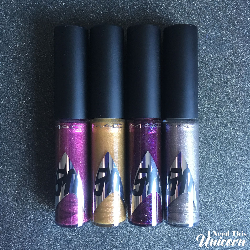
The lipglasses were as expected from the Mac formula. They’re sheer and aren’t long lasting. They’re supposed to be sheer and aren’t supposed to be long lasting. The glitter doesn’t feel so gritty. But I do like them better than the lipsticks. They’re colors I’m more likely to wear and the odd colors are useable as toppers.
KHAAANNN!
They couldn’t have a Star Trek collection and not even mention Khan! Personally I really like this shade, its pink and glittery. Right up my alley. It’s not opaque, but that’s to be expected. I wear this by itself.
Warp Speed Ahead!
Make it so! Another color I really like, but this time’s it’s berry and with blue sparkles. It looks purple in the tube but comes out a more berry color. It’s also not opaque, but I knew that. I’ve worn it out by itself. It’s not long lasting, but lipglasses never are. I still like and wear it.
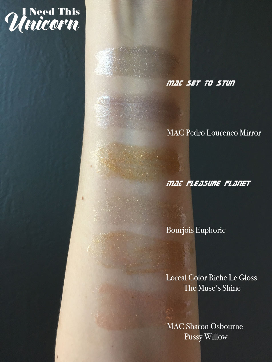
Set to Stun
The name reminds me of Riker and this meme (not mine!):

This is obviously a silver, you choose to look like a robot or use this as a topper in the center of the lip. Well don’t worry it’s not opaque enough for you to be a robot! But it’s not particularly flattering on me by itself.
Pleasure Planet
Riker strikes again! This is named for Risa, the planet Riker likes to take his vacation. Nothing ever good happens on Risa. Don’t let your significant other go there without proper supervision. Fortunately this lip gloss doesn’t have brain washing powers and no one loses a kidney!
I think gold is a more flattering lip topper than silver. But all gold by itself is not flattering on my NC15 skin tone, but it might look good on someone with a darker skin tone and more pigmented lips.
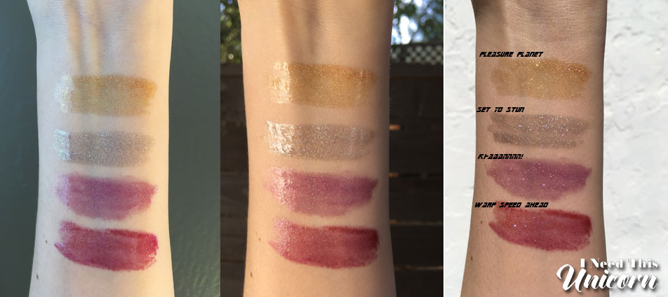
Lipglass Comparisons:
Studio Nail Lacquers
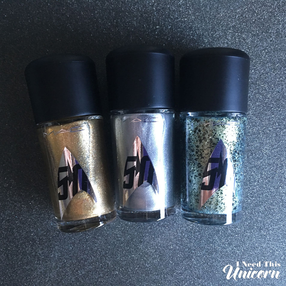
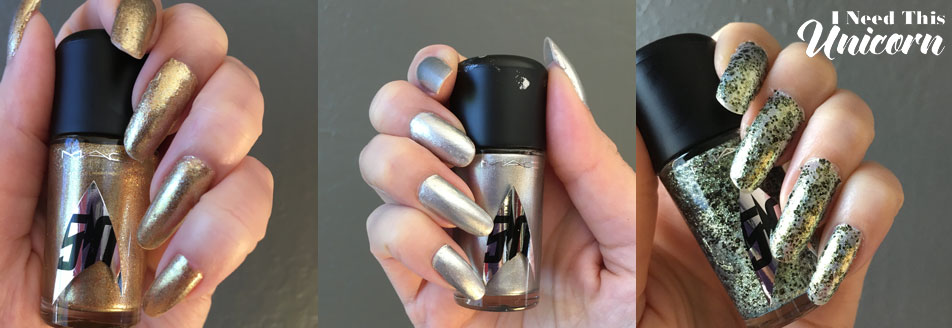
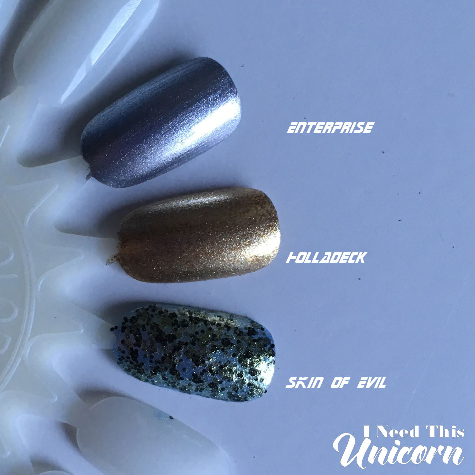
Holladeck and Enterprise were opaque in two coats, but I applied 3. I like my glitters to be dense so I applied 3 layers of Skin of Evil.
The metallic finish makes it unforgiving when it comes to texture. It will show if your application is uneven.
Pictured is 1 day of wear, its already worn off the tips and I got a chip in the silver one. I wore 2 top coats, an anti-chip one and a speed top coat. As I do with every manicure.
Holladeck is a gold metallic with glitter
Enterprise is a straight up metallic
Skin of Evil has a spring green base with fine gold shimmer and black glitter which translates to green when layered.
Lashes
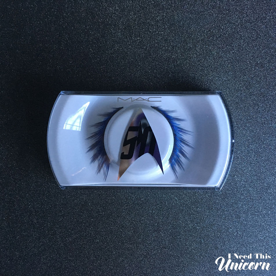
I have not touched the lashes, I wanted to keep them pristine. I should actually use them so it was worth the money.
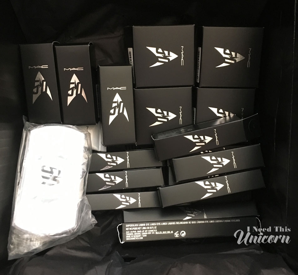
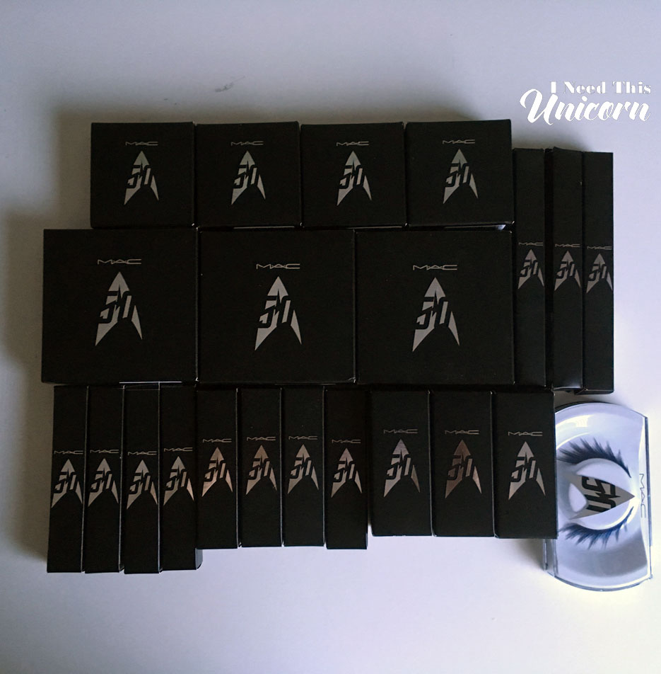
As crazy as I was over the collection, reading my review I didn’t completely love the products. The lipsticks could have packed a lot more punch instead we got disappointing finishes… which are sheer and don’t last long. I would have liked to see some Vamplify glosses, those are impressive!
MAC should have hired me, I would have rocked that collection! Dax, Dr Crusher and Janeway would get some love this time. Even you, Tasha Yar!
Of course I enjoyed the experience because it is Star Trek afterall! I know I own more Star Trek memoribilia, but I couldn’t find most of them in time to make this post. I know for a fact that I have a Next Generation communicator pin that chirps when you press it! I wanted the Deanna Troi swim top from Think Geek, but I already blew all my money on the makeup.
Here are more pictures of the displays because I am obviously obsessed:
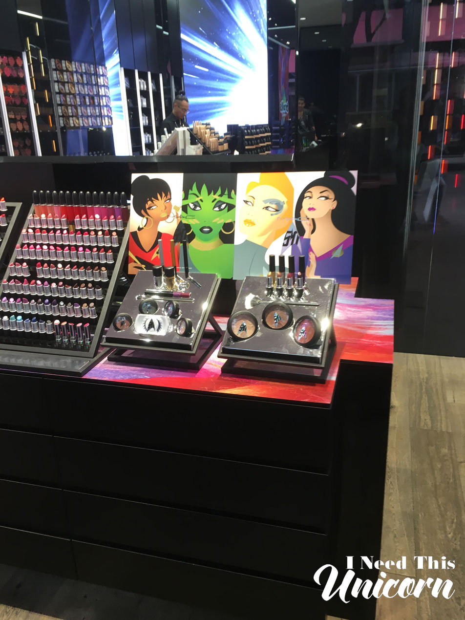
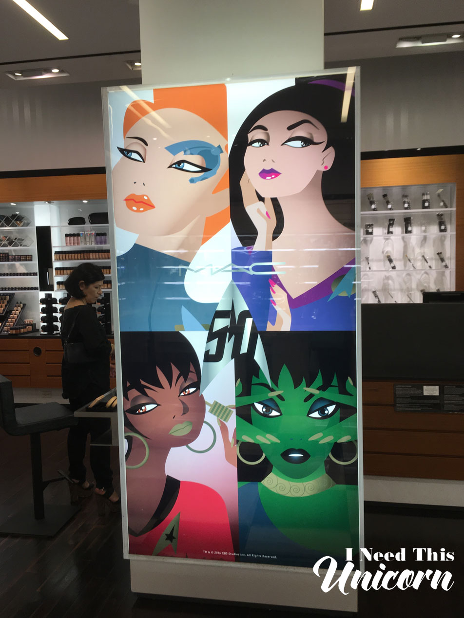
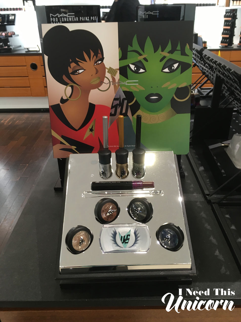
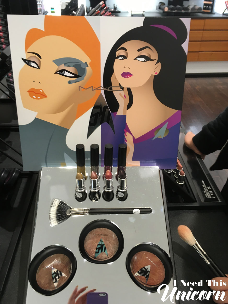
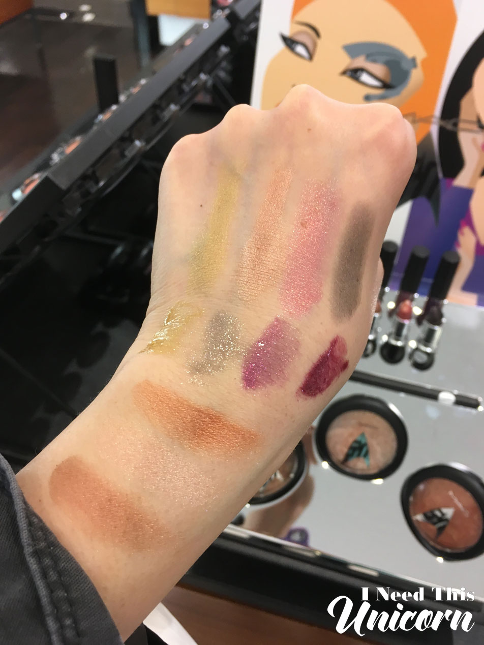
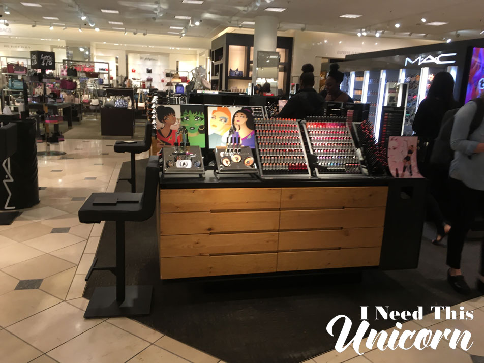
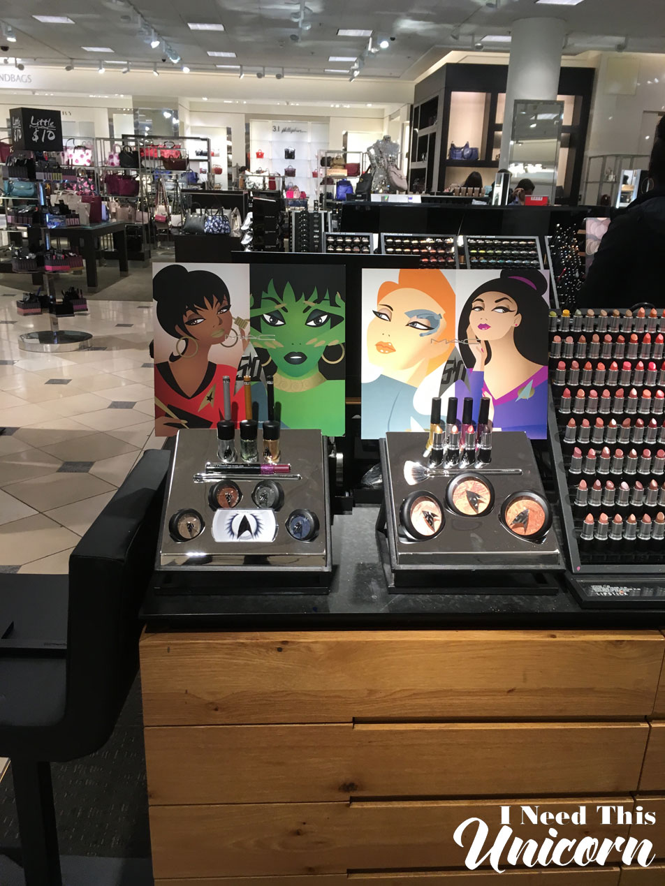
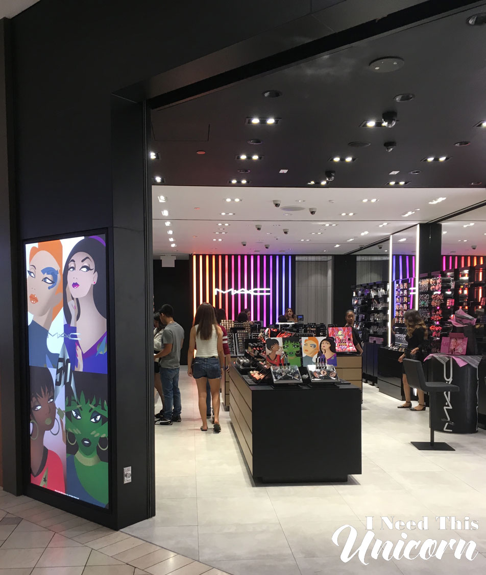
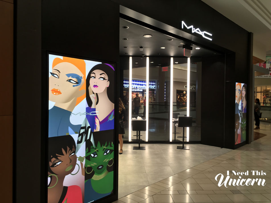
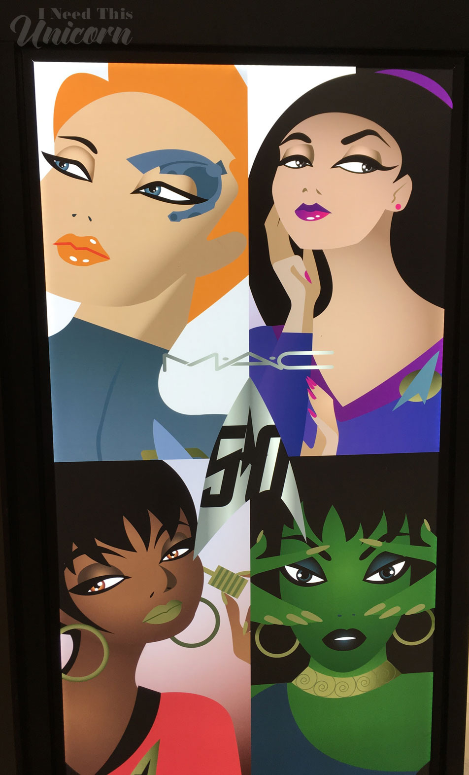
Dear Mac Cosmetics, Who can I talk to about getting this as a print for my wall? It doesn’t need to be massive, the size of the makeup display is just fine!

Disclaimer: Everything was purchased by me with my own money. My empty fridge can attest to that.
Also I am also working on getting this site responsive. As in, make it friendly for mobile phones and tablets. I don’t like the default, and I’m pretty picky about how it looks. I’m not a coder, so I have to talk someone else into doing it.

