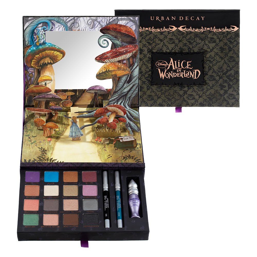
I was disappointed that I missed the first Alice in Wonderland palette by Urban Decay back in 2010. I think ever since then, I’ve been determined to collect Urban Decay palettes because I think they’re great quality and they encourage me to try new, bold colors that I wouldn’t normally wear.
The shadows in the original Alice in Wonderland palette were just renamed from their permanent colors if you wanted to build your own. Temptalia has laid it all out for you, if you wanted to find out which color is which. The colors in the new Looking Glass palette are all new, and as far as we know now, are exclusive to this palette. (But who knows if they will release them as singles in the future.)
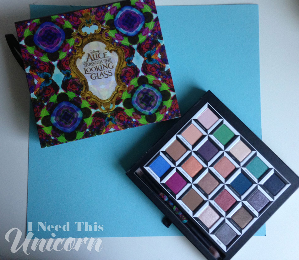
It’s funny how different the Urban Decay palettes look now and it’s only been 6 years! They went back to to “old school” packaging by making the new palette in a drawer unlike the Vice palettes. But it’s still different. There were less eyeshadows but they also included eye pencils and a primer. The new palette includes a brush. You decide which is better, I’m happy with any!
The one thing I like better in the first Alice palette is the pop up! I like the illustration of little Alice in the forest of mushrooms, and a mirror behind it. It doesn’t make the mirror practical, but I don’t use mirrors in palettes anyway. The pop up in the new palette is a butterfly, which is really pretty, but the diorama tells you a story. You don’t really see the butterfly unless you are actively trying to look at it. So it’s not like its a nice background picture because you have to go through the effort to appreciate it and you probably wont look at it much. Personally I prefer the diorama pop up that you can see while doing your makeup.
Urban Decay: Alice Through The Looking Glass eyeshadow palette has been out for a few months. So I am little late, but I didn’t want buyer’s remorse, remembering how I missed out on the first Alice palette. I think I’ll have been bigger buyer’s remorse when the palette goes on sale for a fraction of the original price! This palette is $60, which is a lot of money in my opinion, but we are also paying for the special packaging.
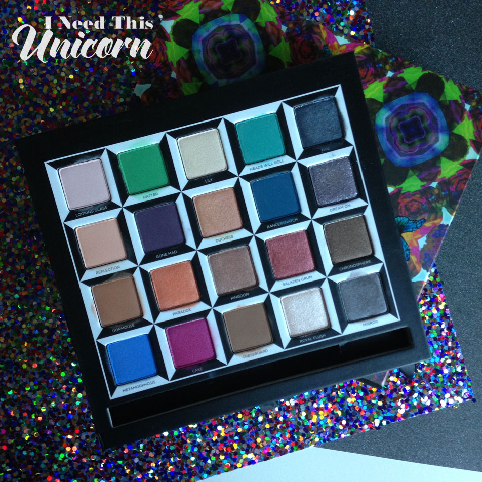
Would I have purchased this palette if it was not Alice in Wonderland branded, as is if was a Vice palette? Probably. There are colors in here that attracted my attention, like Dream On, Cake and I always love purples so Gone Mad was a color that caught my attention.
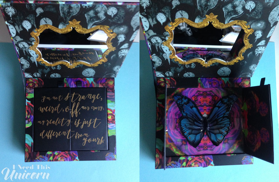
The colors are sectioned by character by row vertically. I’ve only given a few colors my first impressions since I haven’t worn them yet.
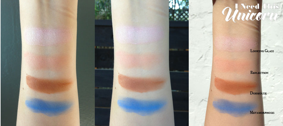
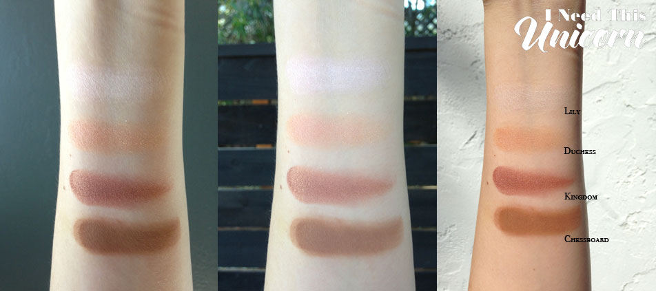
Lily- very surprising! It thought it was a yellow based off white, but it swatched more a duo chrome pink!
Chessboard- very silky in the pan and swatches wonderfully! Will probably get used a lot since it’s one of those browns that’s great for the crease, lid and undereyes.
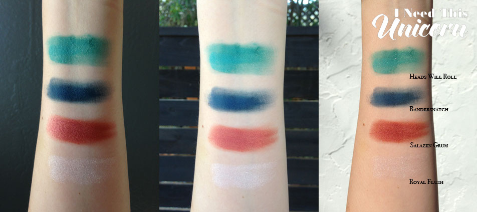
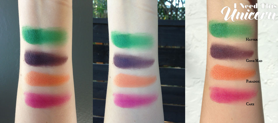
Heads Will Roll- I don’t wear blue or green eye shadows, but this one is so beautiful, I will have to try it. The photo doesn’t do it justice in any of the lighting. It has gold glitter through the formula.
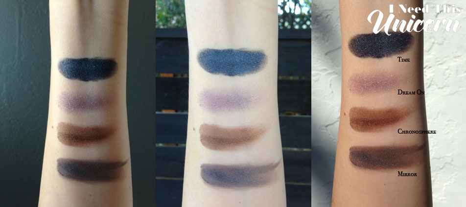
Time- Fall out city! But really pigmented. If youre going to use this, use a shadow shield or do your eyeshadow first. The first time I swatched this, it actually fell onto my other swatches. I ended up rephotographing them all.
Dream On- First of all, the Aerosmith song always pops in my head. And second, it’s so beautiful in the pan, but disappointing when swatched. It needs layering, and I’ll probably use a damp brush. It reminds me of MAC’s Idol Eyes. Dream On is very gritty and stiff when most of the others are very silky. The glittery silver lavender color must be a hard one to make!
Swatches are photographed indoors, outdoors in shade and outdoors in sun light. And that imprint on my arm is from typing on my laptop!
Disclaimer: This palette was purchased by me with my own money.

