I like supporting my favorite YouTubers. They’re so passionate at what they do, and they wouldn’t have so many subs if they didn’t put out good content. I love it when they’re presented with opportunities, someone’s dream came true and that’s a great thing!
Manny is so energetic and funny. He seems like the kind of person that is friends with everybody.
“If you don’t like it, then don’t fucking watch it” Manny is a freakin’ delight!
I actually hadn’t tried Makeup Geek eyeshadows before. I have a few pigments. But it’s one of those things I hadn’t gotten around to purchasing even though I’ve known about them and wanted them for years. Palettes are a good excuse to try something new cause you get a variety and is usually discounted per pan.
Cranberry/rusty red and burnt orange are such a popular colors in current palettes that I started to name every palette I’ve seen these colors in, but it became too many to list! It’s funny how they’re coming out in the spring and some people are like, “Spring Look” and it looks completely fall, but whatever. You don’t have to limited to a certain color palette because of a season. Wear whatever you want, whenever you want!
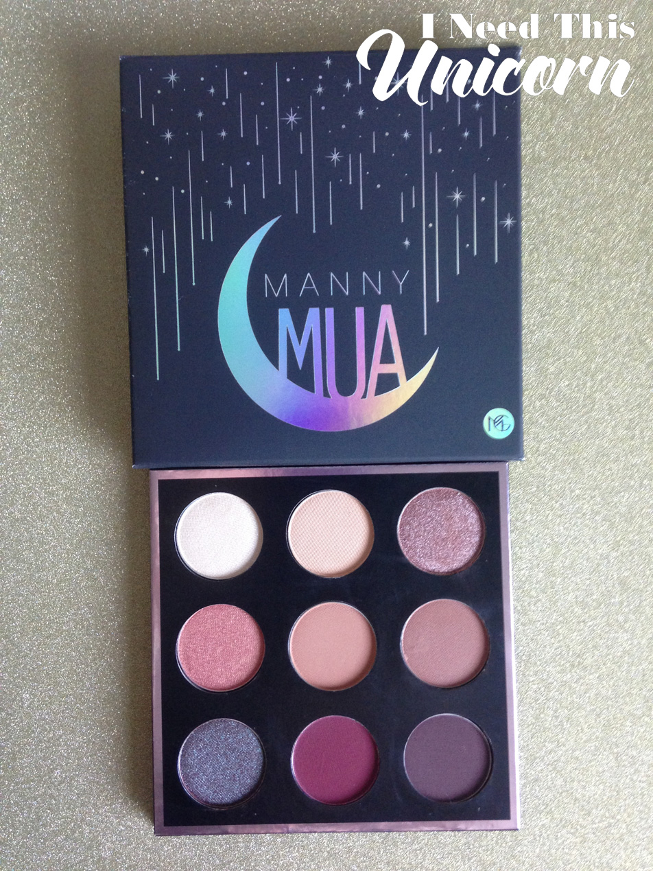
I love the names Manny chose for his colors. I’m really into Greek Mythology and into space. So this spoke to me, even though he really named two of them after the Sailor Moon cats! haha!
Some of them are permanent colors, which disappointed some customers. But I’m completely fine with it. They’re great colors that can be worn by anyone, and I didn’t own any of them anyway so it was no loss to me. But the reason why Manny had include permanent colors was because of the production costs. It would have costed them too much money to come up with 9 completely new shades. And if he did that, it would have taken longer and the palette would have costed more for us. So it was a realistic choice, and one I support. The colors he chose are great for daily use.
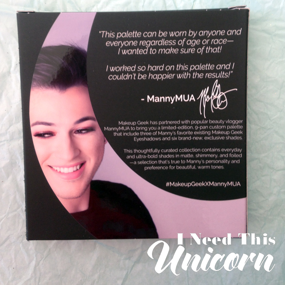
His goal was that this palette suited every skin tone and every age. While at first glance, I’d think that it’s best for dark and medium skin tones. As a pale NC15 myself, I can say that this palette is just fine for those with fair skin. It’s bold, but I like and want that! And it’s not just some colors, every single one of them works for me. As fair skin tone, it will come off as very pigmented. So if you’re into the natural and subtle look, this isn’t for you. Good thing for me, I love the in your face pigment, it’s so much fun to play around with.
When swatching, the foiled shadows were super pigmented. It just took one pass for it to be opaque. The matte colors needed 3 passes. Mars needed several because it was stiff in the pan. But it doesn’t matter when applying it with a brush on the eyes. The mattes applied perfectly fine. Since there were mostly transition colors, I’m glad it wasn’t too potent cause I’d have to start over!
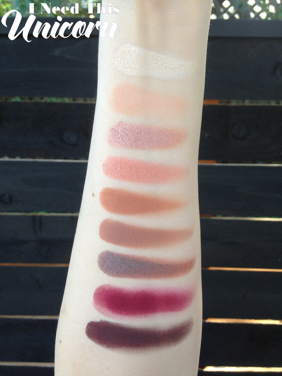
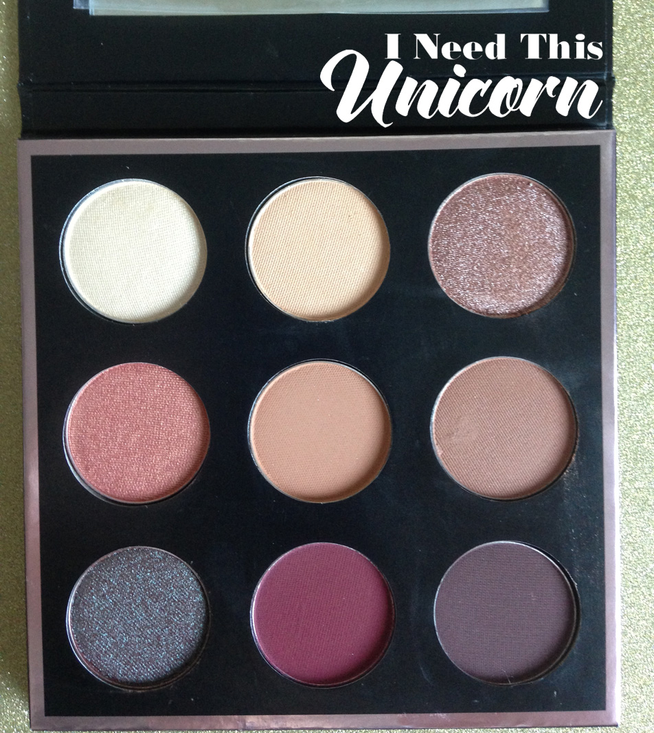
Shade Reviews
Artemis- I love a powerful white gold. I hate the ones that wear off cause they have no staying power. (I use them in the inner corners of my eye and of course they always wear off due to the moisture.) Though it’s a basic color (to me) I love it, I’ll wear it every single day. I’ve actually been reaching for this color when doing my inner corner highlight.
Beaches and Cream- Light enough for me to be a transition color. In between the brow bone and crease color. Frappe and Sora may work better for darker skin tones. I used them all and blended, it worked out well for me!
On NC15, it’s too dark to be a highlight, but on other people this would be great for under the brow bone. This is a permanent color, so you can by this one as an individual any time!
Luna- Ugh so gorgeous! So pigmented! my favorite look to do for this palette is to put Luna all over my lid and have the matte browns as a crease and transition. The foil colors pack a punch and get even stronger with a damp brush. I’m considering getting more foiled shadows because this one is so good.
Cosmopolitan- I loved that this color was included. It was in the Vegas Lights palette, which was on my list of palettes I wanted. But never had to chance to buy. You can purchase it as a single, but I’m glad it was included in this palette. It goes so well with the other colors. This is a dupe for Mac Expensive Pink and Sugarpill Kitten Parade. If you don’t have either, Makeup Geek is the cheapest!
Sora- A warm transition shade. No palette would be complete without a medium toned brown! This warm shade really goes well with the warm shades in the palette.
Frappe- I can’t say I’m sad that a popular matte transition shade was included. Yes, MUG collectors might already have it. But it’s such a helpful color that will get used daily, and I’m glad this was included.
Sora and Frappe look similar in the pan, but I guarantee they’re not the same. Frappe is cooler than Sora. I was taught temperature change in my illustration classes If you’re going to blend colors or have any sort of gradient, having a temperature change is going to round out the color scheme. It’s the same for makeup, you wouldn’t want all 100% warm or all 100% cool. It’s going to look a little dull. So having a medium toned brown, slightly darker and slightly warmer blended in the crease with Sora really completes the look.
Mars- I was surprised at the consistency of Mars. It didn’t feel like the other mattes. In the pan, it felt harder and gritty. But if you want super red, it WILL get red. Just because the consistency is weird doesn’t mean you’re not going to get the pigment on your eyes. It will indeed show up and it is bold.
Insomnia- I like that they turned the loose pigment into a pressed powder. Pigments are so messy anyway! This is similar to Mac’s Club eyeshadow and Blue Brown pigment. This is a fun color and if you don’t already have Mac’s Club eye shadow, Insomnia is probably going to be way more pigmented.
Insomnia is permanent in loose pigment form, but I tend to prefer pressed colors because they are less messy.
When blended out, the brown in the pigment is very red toned. It really pairs well with Mars. It also looks good when patted on top of Aphrodite because Aphrodite has the reddish plum undertone. While the blue/green offsets it, the underlying reddish brown matches.
Aphrodite- Aphrodite is a plummy brown which blends beautifully with the other colors. I felt like this was the perfect dark matte color to go with the palette. I’m thankful that he didn’t just choose a black. So many palettes default to black as the darkest color. Do companies realize how many black eye shadows we already own?
Longevity
We know it lasts all day, it’s super pigmented and it’s Makeup Geek. It’s still bold by the end of the day, I’m sad to remove it because it still looks good. I do apply eye primer but didn’t always set it with a setting spray. It lasted long with and without the setting spray.
The Packaging
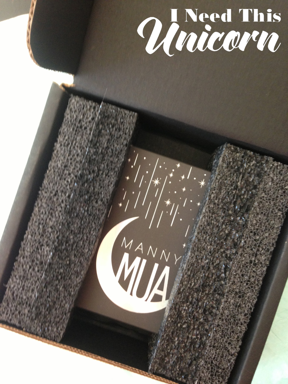
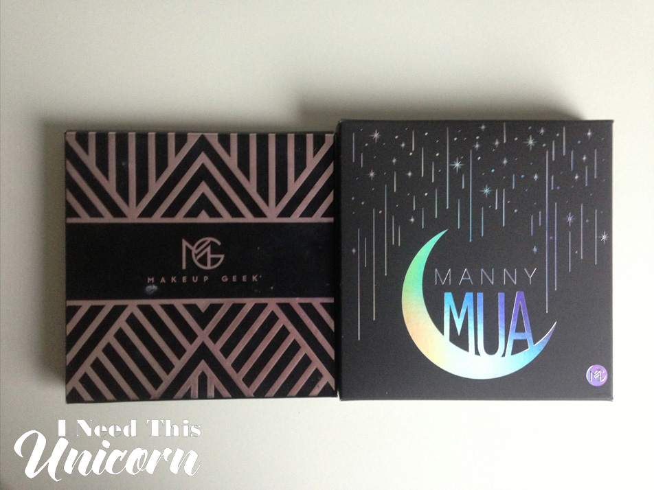
Makeup Geek packages items really well. The mail carrier pretty much tossed it onto my porch. But the palette was floating in between two foam pieces inside the box. No way it was going to break! I appreciate that they cared enough to design the shipping packaging this way.
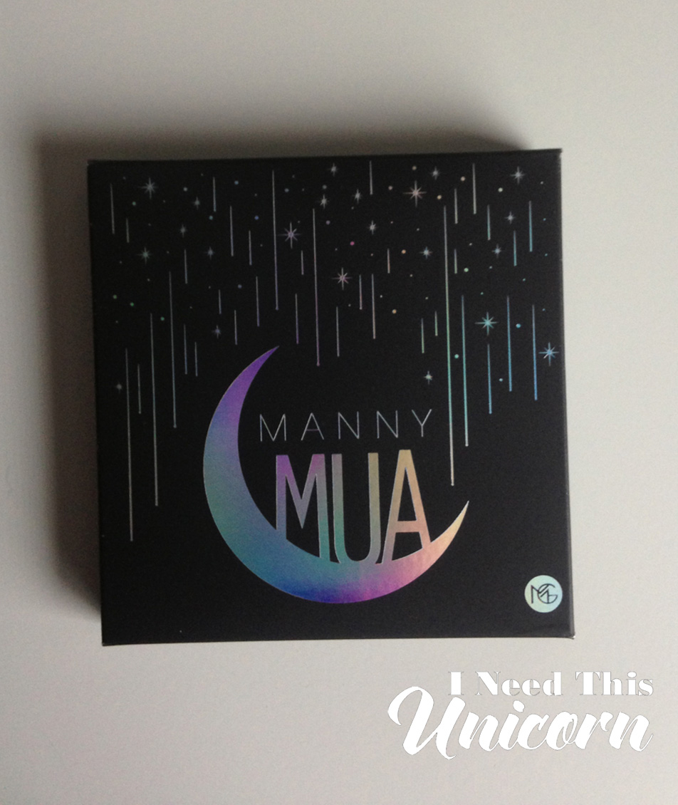
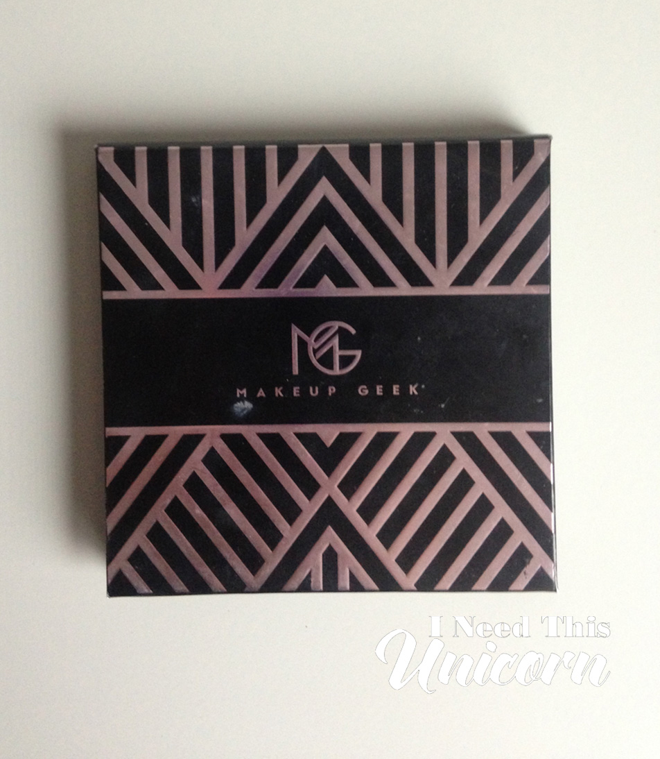
I love Manny’s moon logo so much that I kinda wish it was on the palette itself rather than the just on the box. Don’t get me wrong, I like the rose gold Art Deco design, but I really freakin’ love celestial motifs! And the hologram foil is a great touch!
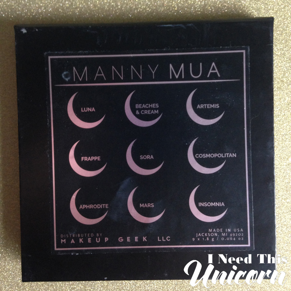
The back of the palette does have the moon motif to indicate the colors. But the position of the labeling confuses people. Too many times, I have seen reviews where people have gotten the names wrong. The names correspond to what color is directly behind it. Not a side-by-side layout. So, Luna is not first, Artemis is. And I am always surprised when people refer to Insomnia as Aphrodite. Don’t makeup geeks know what Insomnia looks like?
If I had a good camera and lighting setup, I’d take pictures of the looks I’ve done. But all I can take is warped selfies and the photo quality isn’t there. Maybe in the future once I get a camera, tripod and a ring light.
Is it a must have? Well, it depends on how much you like the color combo! The colors Mars and Insomnia are the attention grabbers. And if you see yourself craving those colors, this may be for you.
Even without the eye catching Mars and Insomnia, this palette holds it’s own. I have done plenty of looks without using those two colors and it the looks are strong and complete.
Because Makeup Geek is so affordable, I don’t know why I’m sitting on purchasing more colors. The quality is top notch! Especially for the foiled shadows, those are a must for a makeup lover!
This was purchased by myself with my own money.

