What do you do in the wee hours of the night? Well, I look at archives of my old websites. Spooky, right? You’re about to see some old fashioned early 2000’s web pages, and to add more to the fright factor: my sub-par design skills!
Back in my day, even before Friendster, (you know, what came way before My Space and Facebook!) we had our own personal websites. They were just bs journals, sometimes with webcam stills. I didn’t want to be on cam, so I never had that. We also had links to our Amazon wishlist, much like how people today link to Patreon! We often had a sidebar fulls of links to our friend’s websites and mini icons to cliques, fan listings and webrings. No brain cells went into writing these blogs whatsoever. I am going to channel that energy while writing this one. You may not notice a difference.
Back in 2001, a friend of mine from high school and I wanted to start a webzine but it turned into a blog instead. I didn’t get any accurate screenshots of how it actually looked. There were 2 iframes on either side, and in the middle was the blog, authored by the both of us. I’m not sure why it’s only showing my side, that’s what the Wayback Machine is showing me. I also made backgrounds which I recall were baby blue, baby pink and yellow dots, but they’re not showing up, along with many other images. This is the site she built, I pretty much emailed her my blog posts and I numbered them which she found ridiculous.
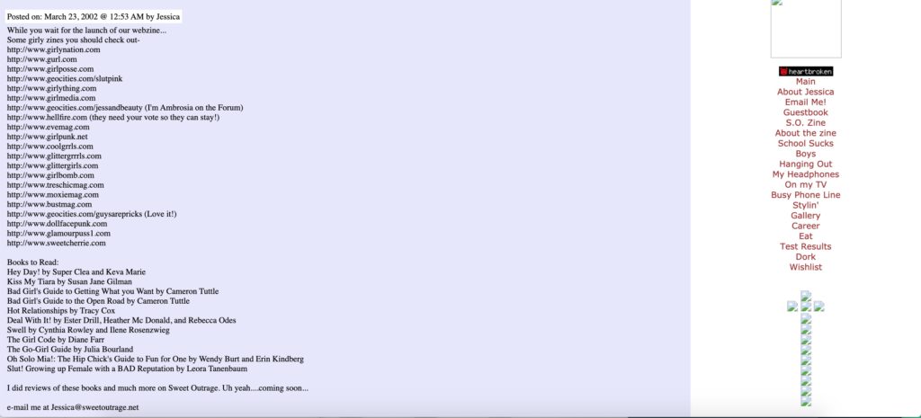
This is the first logo I made, probably in 2001 or 2002. As you can see, this is not what I majored in!

The font is Motterfem D. I don’t know the program I made it in. Believe me, you don’t want this unless you want your website to look like it is from 1998.
In 2002, I eventually made my own website hosted on Geocities, but purchased a domain through Yahoo. It didn’t look as it does in the archived screenshot, but it was messy as hell. I was in college and had to teach myself html, instead of using a what you see is what you get editor. (Back in 1999, I liked to use that via Homestead!) Again, the background image isn’t showing up, but I matched the night sky to the link map on the right. The logo definitely didn’t overlap the text!
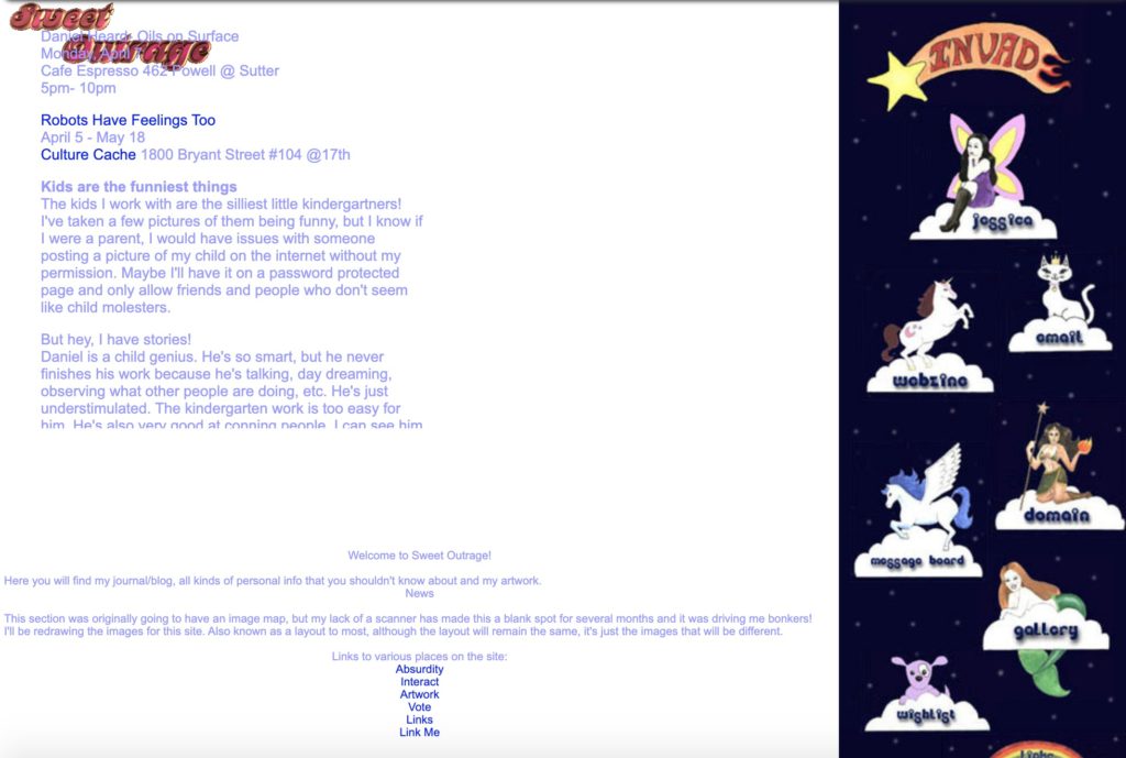
I actually hand drew and painted these in acrylics, scanned it in and Photoshopped it onto the navy background. Then I use some program to turn it into a linkmap.

Here were my splash pages for the blog:
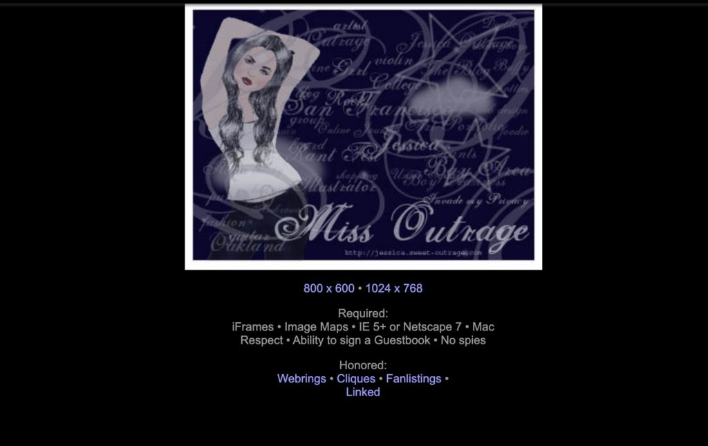
That’s right, a choice of 800 x 600 and 1024 x 1768! I had a clamshell Macbook and it was 800 x 600! And RIP IE and Netscape.
I closed my personal website in 2004 which was a good thing because it would get me in trouble with people. Then stop being interesting! Am I supposed to write about myself?
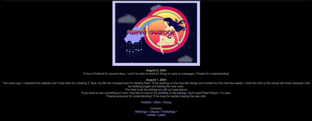
For my portfolio website, I had a lot of splash pages with “coming soon” I was just not great at getting websites up! I was in college, I didn’t have time, nor was I in web design! The only way for me to get anything done was to make it a school assignment. So I decided to ask my college if I could take a more advanced web design course meant for New Media majors. After an interview and a review of my site, the instructor allowed me to skip Web Design 1 and go right into 2, which was a Flash course. Laugh all you want, but we thought it was the future!
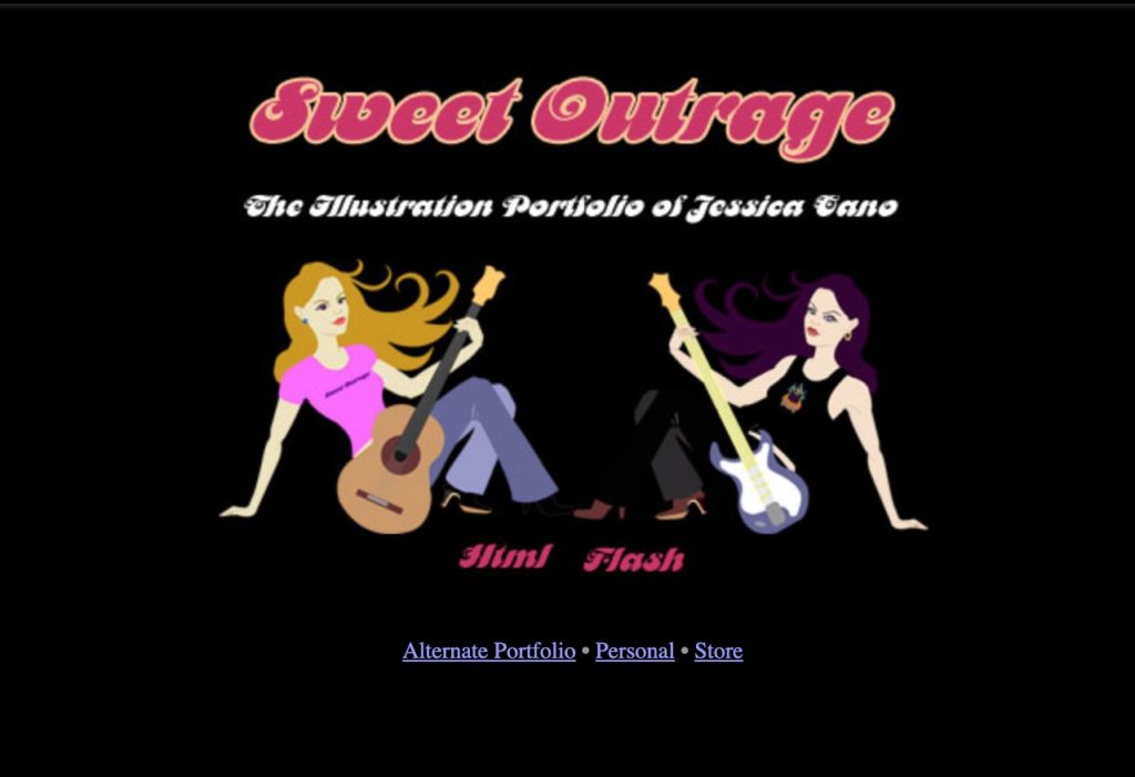
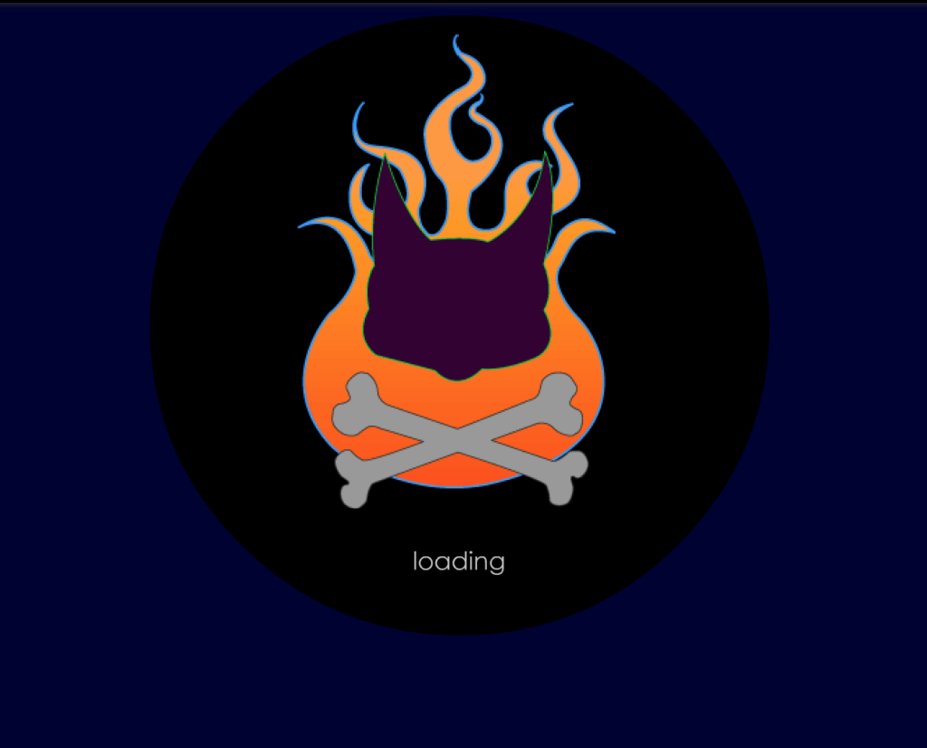
My loading screen had thunder and lightning effects which would turn the cat into a pirate, a vampire or give it eyes. I can tell you now, I have improved my vector skills! There are so many bumps and un-smooth lines, it drives me crazy! I now understand my Beziers!
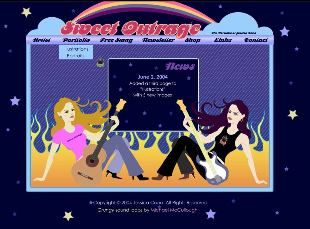
Flash is being disabled so it’s not like I can show you the actual SWF file. But it has music and animations. It won’t load the rest of the pages so the home page is all we have. Um my personal style has not changed. At. All. Maybe I should reconsider….
I took inspiration from many websites of professional artists. Those sites of course aren’t up now, but Simone Legno’s old Toikidoki.it that was full screen, completely Flash with games and music was a huge inspiration to me. I still remember the music! I always liked his illustrations of girls rather than the cute characters but those are the ones that made him popular today! (Okay, I’m a sucker for Unicorno!)
It looks as if I decided to change it. Maybe it was too much for me to keep up with updating the swf file with new artwork. I had a portfolio that scrolled horizontally. A guildmate criticized that no one likes that. I thought being different would set me apart. I don’t have any screenshots of it, it’s turning out blank on the Wayback Machine. But here are some splash pages:
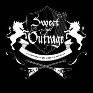
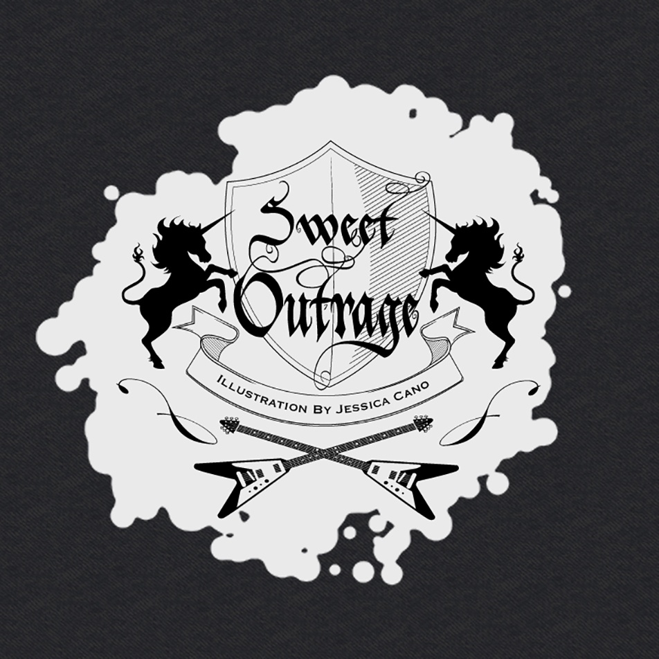
Again with the rickety curves! Old English fonts were all the rage in the late 2000’s! And yes, I have unicorns and guitars, I swear I haven’t changed at all. My latest collections have all-over-print repeating patterns of each!
I made a Photoshop composite of how I wanted it to look, and of course, never finished! This is likely from 2006.
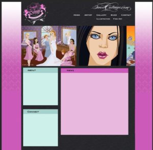
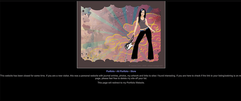
Now it just redirects to this site! I didn’t stop being an illustrator, I just put it onto clothing instead. I figured my art would be more accessible to have them printed on stuff you can wear. Now I actually have to make art! It’s honestly been awhile since I’ve done an actual painting.
I had another business venture, which was couture stationery design. I’ll still design invitation suites if people ask, but I no longer have a portfolio online. I named it after the wedding invitation suite I made. I felt pressured into naming it asap, but I realized it was too similar to a cosmetic company and promptly changed the branding.
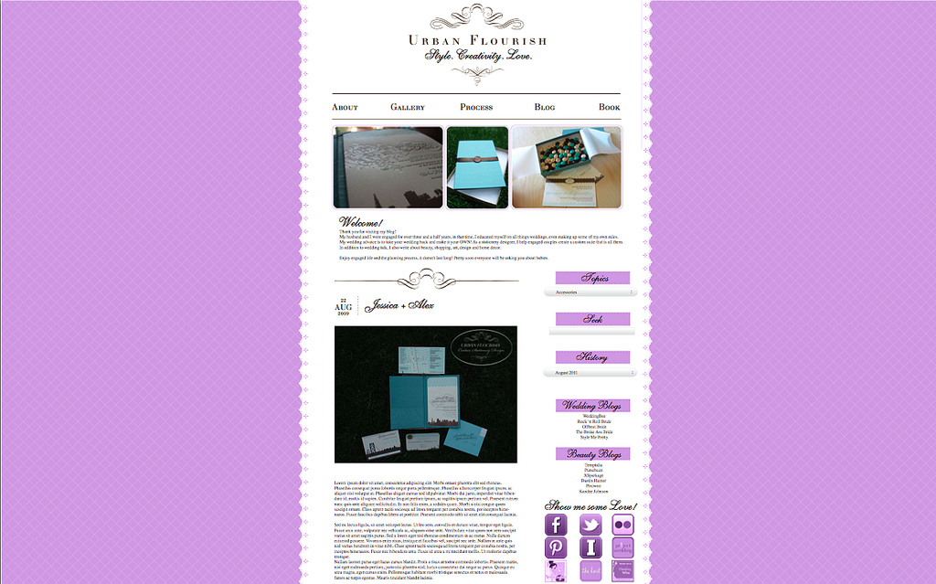
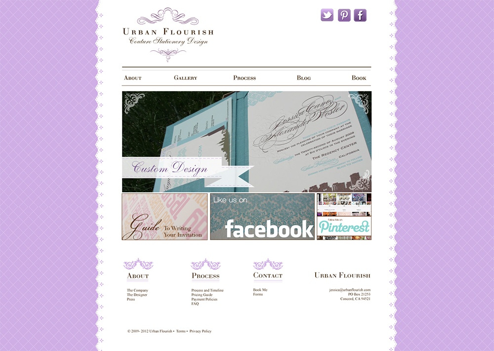
There’s my horror story of my old blogs! I think the lesson here is do not hire me for web design or for logos. That’s not what I studied, but I can draw you some nude figures, I’m highly trained in that. I did just design a logo for a friend, but I also watched 20+ hours on Skillshare on logo design. But she knew what she was getting into when she asked! I’ve come a long way since then. Now I purchase templates.

